A/B Testing Payment Gateway Interfaces: Enhancing User Experience and Interface Optimisation
Why A/B Testing Payment Gateway Interfaces Matters
Imagine a shopper, poised to buy, only to hesitate or leave because your payment interface felt clunky or unfamiliar. It’s not always the product or price that causes cart abandonment—often, it’s the user experience at the final hurdle. This is where A/B testing payment gateway interfaces comes in.
By methodically testing different designs, layouts, and functionalities, you can fine-tune your payment gateway to create smoother, more intuitive experiences. This isn’t guesswork—it’s user experience testing driven by data.
In this guide, we’ll walk you through the why and how of interface optimisation for payment gateways, sharing practical strategies and examples. Whether you run an e-commerce site, subscription service, or SaaS platform, improving your payment interface can directly impact conversions and customer satisfaction.
Understanding A/B Testing for Payment Gateways
What Is A/B Testing?
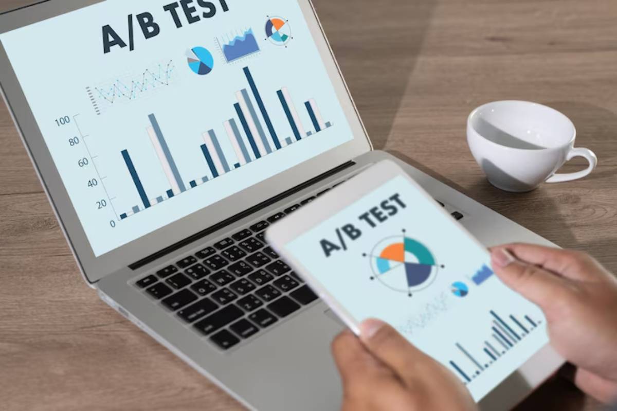
A/B testing (also known as split testing) involves comparing two versions of a web page or interface to determine which performs better.
- Version A: The original (control).
- Version B: A variation with one or more changes (e.g., button colour, layout).
In the context of payment gateway testing, you’re experimenting with the design and functionality of your checkout process to see what encourages more completions.
Why Focus on Payment Gateway Interfaces?
- Critical Touchpoint: The payment interface is where browsers become buyers.
- High Impact: Small tweaks here can lead to significant improvements in conversion rates.
- Complex Decisions: Payment involves trust, security, and usability factors that require careful optimisation.
Key Elements to Test in Payment Gateway Interfaces
1. Form Layout and Field Order
- Variation Example: Compare single-column vs. two-column layouts.
- Impact: Reducing cognitive load can streamline data entry.

2. Payment Method Options and Placement
- Variation Example: Position PayPal or digital wallets higher up in the list.
- Impact: Prioritising popular methods can increase completion rates.
3. Button Design and CTAs
- Variation Example: “Complete Purchase” vs “Pay Now” button text.
- Impact: Clear, actionable CTAs reduce hesitation.
4. Trust Signals and Security Icons
- Variation Example: Display security badges at different stages.
- Impact: Boosts trust and reduces payment friction.
5. Progress Indicators
- Variation Example: Show steps remaining vs. no progress bar.
- Impact: Helps users understand where they are in the process.
6. Mobile Optimisation Features
- Variation Example: Larger buttons and simplified forms on mobile.
- Impact: Ensures a user-friendly experience on smartphones.
Steps to Conduct A/B Testing on Payment Gateway Interfaces
1. Identify Your Objective
- Example Goals: Reduce cart abandonment, increase completion rates, or improve mobile conversions.
2. Select One Variable to Test at a Time
- Tip: Avoid testing too many changes simultaneously, which can muddy results.
3. Segment Your Audience
- Strategy: Split traffic randomly but equally between the two versions.
4. Define Metrics for Success
- Examples: Completion rate, time to complete, drop-off points.
5. Run the Test for Sufficient Time
- Guideline: Continue testing until you have statistically significant data.
6. Analyse Results and Implement Changes
- Action: Adopt the higher-performing variant and plan the next test.
Real-World Scenario: Optimising a SaaS Payment Interface
A SaaS company noticed high drop-off rates at the payment stage. They ran an A/B test comparing their current layout (Version A) with a simplified, mobile-first layout (Version B).
Version B featured larger buttons, auto-filled forms, and PayPal positioned at the top.
- Result: Conversion rates increased by 22% for mobile users, and overall payment completion rose by 15%.
This case highlights the power of user experience testing and interface optimisation.
Best Practices for Payment Gateway Interface Optimisation
1. Keep Forms Simple and Intuitive
Only collect essential information and make the fields user-friendly.
- Example: Auto-detect card types based on number input.
2. Prioritise Speed and Performance
Ensure your payment pages load quickly.
- Fact: A one-second delay can reduce conversions by up to 7% (source: Akamai).

3. Tailor for Mobile Users
Design with a mobile-first approach.
- Tip: Use responsive layouts and tap-friendly buttons.
4. Leverage Trust Signals Strategically
Display SSL certifications, secure payment logos, and privacy policies.
- Outcome: Builds trust during critical moments.
5. Iterate Based on Data, Not Assumptions
Always base your changes on test results.
- Strategy: Use analytics tools like Google Optimise or Optimizely.
Comparing Tools for Payment Gateway Testing
| Tool | Key Features | Suitable For | Pricing |
| Google Optimize | A/B testing, personalisation | Small to mid-sized businesses | Free/Paid tiers |
| Optimizely | Advanced experimentation | Enterprises and large businesses | Paid plans |
| VWO | Heatmaps, A/B testing, funnels | E-commerce and SaaS | Paid plans |
| Unbounce | Landing page A/B testing | Marketers and e-commerce | Paid plans |
These tools support payment gateway testing as part of broader user experience testing strategies.
Trends in Payment Gateway Interface Optimisation for 2025
1. AI-Powered Personalisation
Adaptive interfaces that tailor payment options based on user preferences.
2. Biometric Authentication Integration
Facilitating payments via facial recognition or fingerprint scans.
3. Voice-Activated Payments
Enabling hands-free payment options, particularly for mobile users.
4. One-Click Checkouts
Minimising steps for returning users through saved details.
Staying ahead of these trends ensures your payment interface remains competitive.
Conclusion: Optimise for Conversions with Payment Gateway A/B Testing
Fine-tuning your payment gateway interface isn’t just about aesthetics—it’s about creating user-friendly experiences that build trust, reduce friction, and increase conversions. With A/B testing, you can make data-backed decisions that optimise your checkout process and drive measurable results.
By testing elements like form layout, payment options, and trust signals, and leveraging emerging technologies, you can ensure that your payment process is as smooth and effective as possible.
Ready to optimise your payment gateway? Share your experiences or questions below, and subscribe for more insights on interface optimisation and user experience testing!


